Though many consider functionality, aesthetics, and resale value while designing their home, there are others who prefer to...let’s just say….personalize their space. There is nothing wrong with inserting your own personal style into a house, however, if you have over-the-top ideas, they may be a turn-off for potential buyers. Take, for example, these 40 design failures. From the treacherous to the hilarious, these outlandish ideas will have you scratching your head.
Completely Exposed
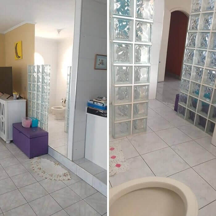
Aside from the outdated glass brick, this toilet is completely exposed. To make matters worse, this awkward commode is the first thing you see upon entering this home. Imagine being a guest, you hear “Come on in”, open the door and there is Jane copping a squat.
This is certainly a design failure on many accounts. Bathrooms should have doors not only for privacy but also to contain any unfortunate odors that may occur from within. Even if they decided to install a door or a curtain, the walls of the space are made from glass bricks allowing anyone and everyone to sneak a peek should they so desire. And last but not least, the placement of the space, perhaps you shouldn’t have blueprinted the bathroom within eyeshot of the front door.
Flooding Failure
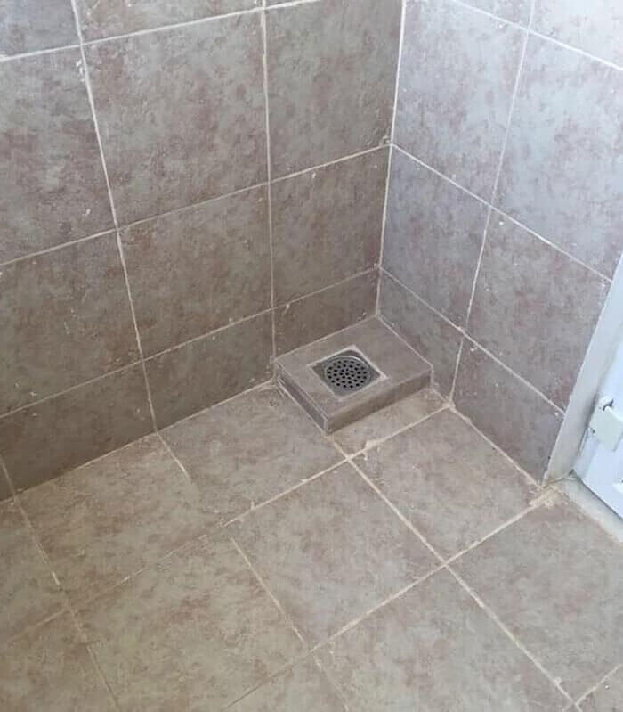
Though it may seem like common sense to install a drain at the lowest point of pooling water, not all contractors get it right as you can see in this photo right here. The construction workers on this job took it upon themselves to put the drain on its own little pedestal.
What’s worse is this pooling area is adjacent to a door so once the flooding begins, it will only spread throughout the property. We get it, water is precious and shouldn’t be wasted but it does need direction so it doesn’t cause any damage. Though they certainly don’t have to worry about any clogging, they do have to worry about flooding. Personally, we would rather snake the drain.
Decorative Overkill
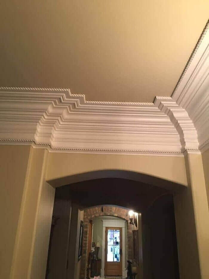
There is no doubt that the addition of crown molding can add character and charm to a home, however, this designer took things a little too far. As you can see, instead of adding one layer of molding, they stacked a whopping 13 to create this monstrosity of epic proportions.
While it may seem the more decorative your moldings are the wealthier you look, the truth of the matter is, there is such a thing as decorative overkill. Instead of being a stunning feature in the room, this addition is an eyesore that would most likely be removed once the house was sold. Don’t overthink it and don’t overdo it, small touches of elegance are all you need to make a room come together.
The Corvette Diner Called
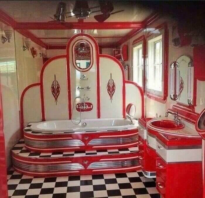
We can definitely say that this homeowner stayed true to his 50s diner decor obsession by designing this incredibly unique bathroom with all of its “cool cat” features. While Guy Fieri may be a fan, this Corvette Diner design will most likely turn off other potential buyers as they will see the room as a necessary renovation.
The ruby-red finishes combined with the checkerboard floor may be a bit overwhelming for those looking for a home with a tranquil master bath. The raised tub surrounded by a chrome finish may turn off a buyer who likes a more modern design. Though the design is fun and creative, it is not to everyone's taste. Hopefully, the owner has no plans of selling anytime soon.
Pleather? Really?
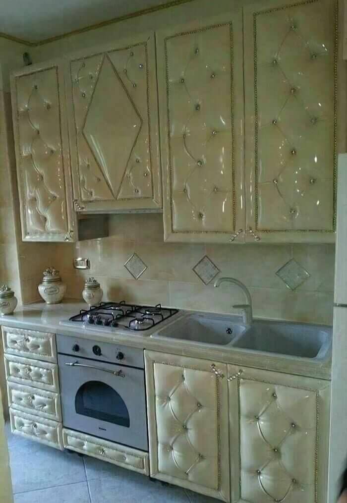
Oooof! Never in a million years could we have imagined that someone would design tufted pleather cabinets but here we are….ta da! Where do we even begin with this design failure? Granted, tufted sofas seem to be an ongoing trend as they add a bit of glamour and opulence when featured in a home. Kitchen cabinets, however, look downright tacky.
The fact that the designer opted for pleather is bewildering. Not only is it a fire hazard being so close to the open flame of a gas stove but it is also reminiscent of a padded cell. As if the cabinets didn’t already stand out, the designer then chose to accessorize using faux jewels for handles and trim. The face of the oven says it all, sad, sad, sad.
Up On a Pedestal
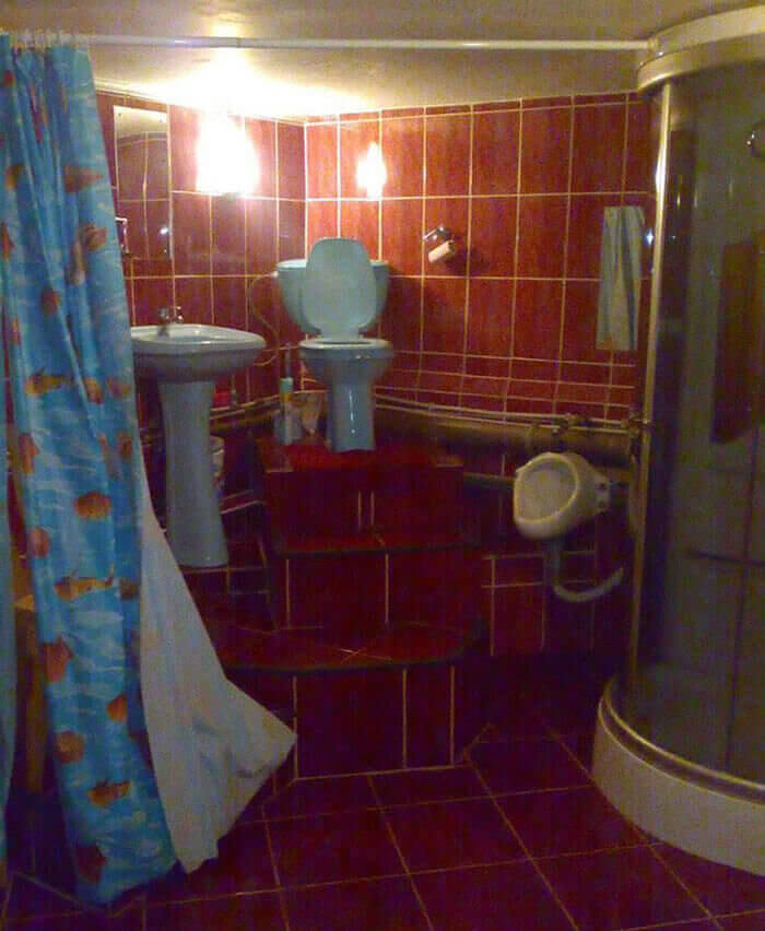
I present to you a commode fit for a king. This homeowner felt the need to give his porcelain throne a pedestal on which to sit. While the view may be better up there, we aren’t sure this is a very wise design choice. Imagine if you were ill and needed to get to the toilet quickly. Imagine being intoxicated and trying to maneuver those steps. Yes, we are quite certain that this design could eventually cause an embarrassing accident.
We should point out though that the homeowner did think some things through. They added a urinal for those who are too tall to urinate in the mighty high toilet and they added a shower curtain so the king could have additional privacy.
The Use of Natural Elements
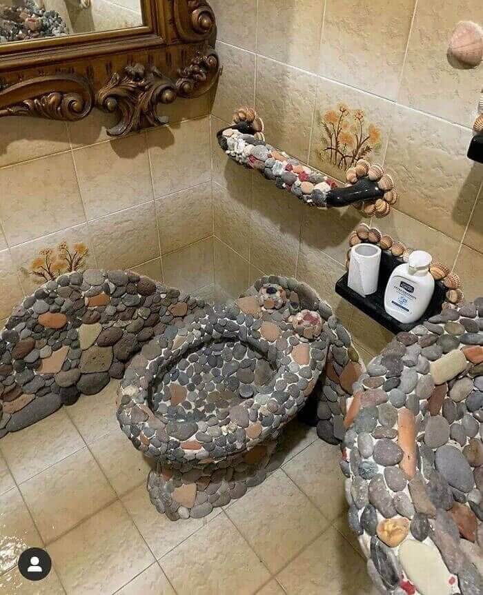
Just because the elements of nature are beautiful doesn’t mean you have to go to such great lengths to incorporate them into your design. In this instance, the homeowner has essentially made this bathroom unusable. Aside from the severe discomfort one would experience sitting on this fixture, can you imagine how challenging it would be to clean?
Even if they had applied epoxy over the stones to, you know, make it comfortable, the stone overload is far from stylish it’s an eyesore. If you are a fan of rocks, display some in a bowl. There is no need to go glue gun crazy making the fixtures in your house either disgustingly dirty or unusable.
A Step Above
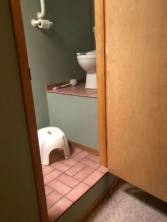
Well, who knew that raised toilets were a trend? This lovely commode doesn’t even have steps leading up to it, instead, the homeowner has provided a flimsy little step stool for their guests to use. While the height of the platform will prevent the dog from drinking the toilet water, it may also cause some serious and embarrassing accidents.
Imagine waking up in the middle of the night and trying to mount this raised commode, certainly not an easy feat. To make matters worse, the toilet paper dispenser is installed directly over the edge so in order to snag a piece you have to precariously balance while leaning forward. Nope, no thank you, it would be easier to go outside in the bushes.
A Fan of the Funhouse
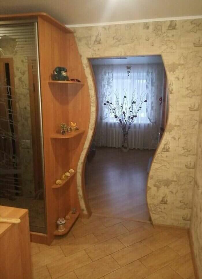
No, this doorway has not been photoshopped, it is actually curved by design. Though the rest of the furnishings and decor seem relatively traditional, this homeowner decided to throw a curveball to his contractors when coming up with the plans. So, a few questions here. Was the corner shelf an afterthought once the door was built?
How do you manage to walk through the door while overly intoxicated, or even sober for that matter? Was your inspiration a funhouse or a trip on hallucinogens? We must admit this is definitely a unique feature we have never seen before, however, the jury is out as to whether or not we like it.
The Great Divide
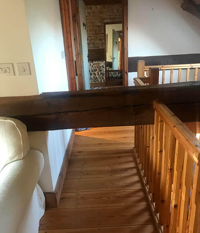
This great divide is a great mystery to us. Yes, that is a monstrous beam blocking the hallway and yes, it is built into the construction of the house. The why, however, is unknown. Judging by the size of the beam, it would appear to be used as a weight-bearing tool to hold the house up, however, it wasn’t installed in the proper location.
In order to be weight-bearing, it would have to be installed under the other beams, not in the middle of the wall and through the staircase. Either way, this is not only an eyesore but is also incredibly inconvenient for the person living in the room behind it. It is also a huge red flag to potential buyers as they may assume the house was not constructed properly.
Fat Fridge, Tight Space
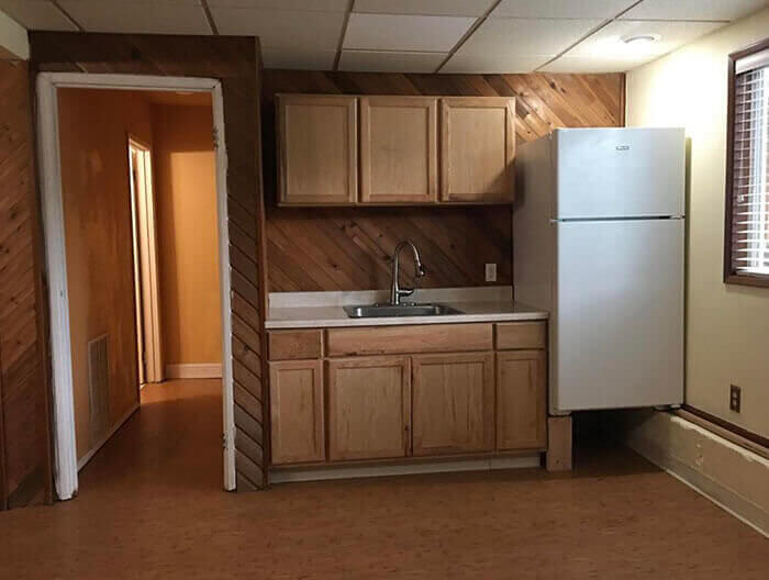
While this photo does seem rather bizarre, the homeowner did have a good explanation as to why the refrigerator is perched above the ground. In an effort to save money, they transferred the appliances from their old house to their new house, never realizing that the space in this kitchen wasn’t quite large enough. Though it looks odd, they did a good job of leveling the refrigerator while also balancing it on a pipe and a wooden block.
Now, there is probably a better way to improve the layout of this tiny kitchen. Why not move the fridge to a different wall so they can actually add a cooking element to prepare the food that is in it. You know, like an oven or stove? It’s not rocket science folks.
A Padded Petri Dish
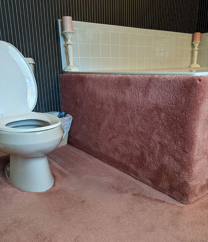
Yes, having a small bath mat is a necessity, it allows you to dry off your feet after a shower and keeps your tootsies warm in the winter. Small, easy to wash, adds a bit of color, no problem. The homeowners of this house took it one step further by carpeting every inch of their bathroom. They carpeted around the toilet, the sink, and the actual sides of the bathtub (how they did that, we will never know).
Aside from looking tacky and outdated, carpet in the bathroom can lead to huge mold issues and an abundance of germs. Just imagine what is on the fibers at the base of the toilet. Don’t want to? We can’t blame you. Guaranteed, if you are trying to sell a home with this water closet decor, potential buyers will be running for the door.
The Stairway to Hell
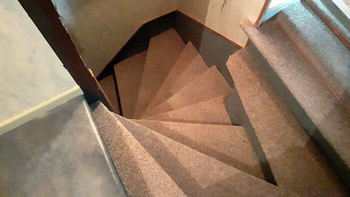
Sadly, this stairway looks as though it ought to come with a disclaimer that says “You are going to fall so be prepared”. Granted constructing stairs in this twisty corridor is no easy task, even so, at first glance you can tell these may not be up to code.
The actual steps themselves are not wide enough for an adult foot so you would already be in danger walking either on your tiptoes or your heels. In addition to the narrow walking space, the stairway’s spiral formation and lack of handrails are also a recipe for disaster. Most buyers, especially those with young children, would take one look at this and say “no thanks” due to their safety concerns.
A Rogue Fridge
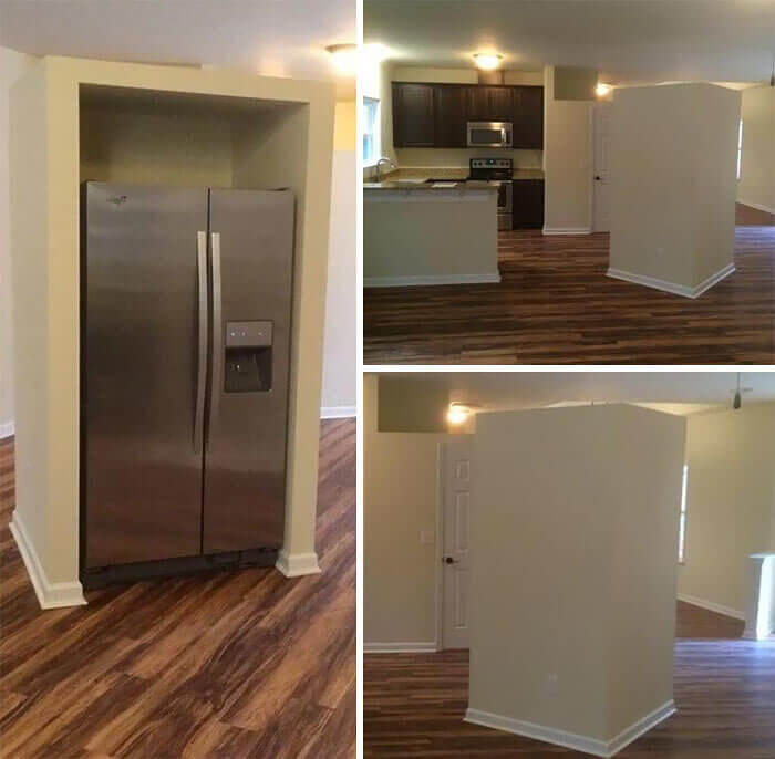
Well, it seems as though we have found the solution to the other refrigerator problem, just leave it in the middle of the room as this designer did. OK, that is a joke folks, this is absolutely bizarre. Whether they forgot to incorporate the refrigerator into the blueprints or they were hoping to start a trend, this massive icebox ended up smack dab in the middle of the room.
It isn’t tucked away into a corner as it should be, heck, it isn’t even flush with the counter. It is nowhere near the sink, stove, or the counters, it is just floating out there in what should have been the dining space. This is a definite design failure.
The Walls Are Hungry
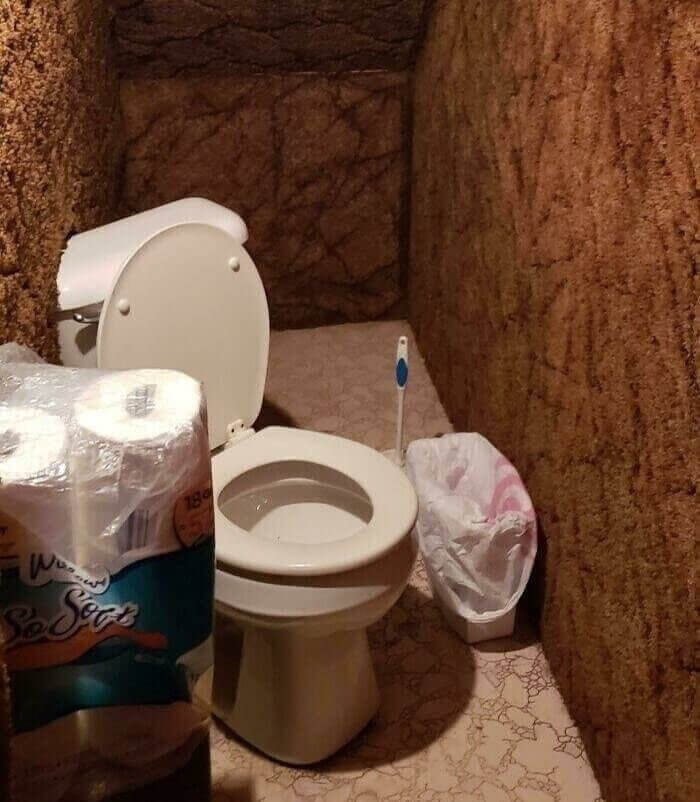
Oh dear, what do we have here? You guessed it, this is a toilet installed under the stairs. While it may be installed, it certainly isn’t installed correctly as it appears to be diagonal with part of its tank being consumed by the shag carpeting on the wall.
Now, let’s talk about the shag carpeting for a moment. First of all, it is brown, the color of excrement, yes, we said it, secondly, it is only on the walls for some strange reason. Because there is no sink to be found, one must question if the carpeting started out that color, right? Now, in their defense, there is plenty of toilet paper but that doesn’t take away from the fact that this pseudo-room is quite likely full of mold and germs.
Naked and Afraid
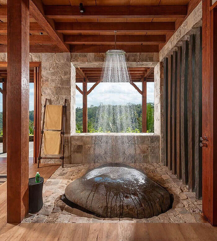
Though this is probably one of the most luxurious bathrooms we have seen so far, the designers missed the mark when executing their idea for the shower. Because this room is located in a posh jungle resort, they wanted to use natural elements to bring the outside in. While that is a great idea, instead of using small rocks with an epoxy finish, someone decided that an uneven boulder would have a better effect.
Just like the rocks along the shore, this boulder will be an immediate slipping hazard as soon as the water hits it. So, unless you want to bathe sitting on your bottom, you may want to wear some no-slip river shoes.
A Mauve Mess
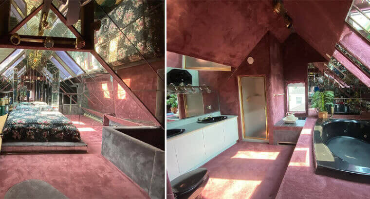
Remember that scene from Friends where Phoebe screams “My eyes, my eyes”? We second that sentiment when looking at this photo! So, where to begin? This classic 1970s masterpiece reminds us of both Barry White and Betty White. From the mauve carpeting to the mirrored ceilings, you know that this owner's intention was to create a master love shack in their master bedroom.
Their love for carpeting is apparent as it covers nearly every inch of the space, including the ceiling in the bathroom. Mirrors apparently came in a close second to the carpet as you can see. We would like to think they were installed to make the room appear larger but seeing that the majority are placed above the bed, there was most likely an ulterior motive.
Good Intentions
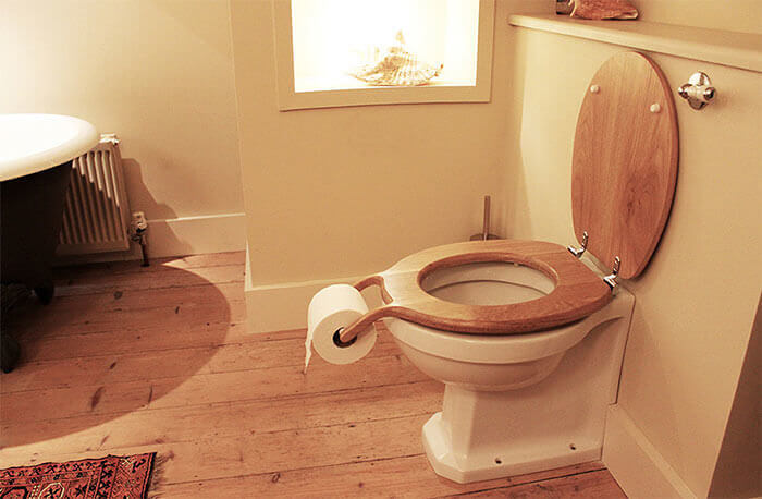
Whoever invented this toilet seat surely did so with good intentions, however, this design has its flaws. While it may be easier to reach the toilet paper since it is right there between your legs, it is painfully obvious that the TP would quickly become unsanitary.
Think about it, where do men stand when they urinate? That’s right, they stand in the same spot as the toilet paper roll so should they dribble, the TP will be right there to catch it. Also, what happens when you flush the toilet? Yep, it splashes. Though this design was good in theory, the positioning of the roll creates a pee pad instead of hygienic paper.
The Wall Washer
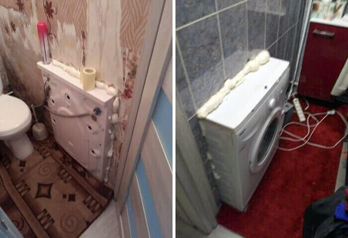
While this creative installation of a washing machine was most likely done to save space, the design, or lack thereof, will definitely cause some serious issues. As you surely know, washers spin and shake, sometimes violently if the load is unbalanced so imagine what will happen to the tiled wall that surrounds it. It’s quite probable that those tiles will come crumbling down.
Seeing that this appliance has been installed in between two bathrooms, the wall surrounding it must also be full of pipes. If the washer and walls are shifting then the plumbing probably will too. Rule number one when designing a house? Don’t mess with the plumbing.
Dirty Decor
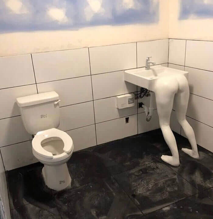
Well, if the owner of this custom-made sink was going for shock value, they certainly achieved their goal. We can only assume that this skeevy design was created for an “edgy” bar or a strip club, even so, in our opinion, it looks pretty trashy.
So, what was the goal here? Create a photo opportunity for frat guys? Entice perverted behavior in a public restroom? Create a reason for people to avoid washing their hands? Quite honestly, they may have achieved all three. As consumers, this bathroom would have us looking for another place to spend our money.
A Pit Stop
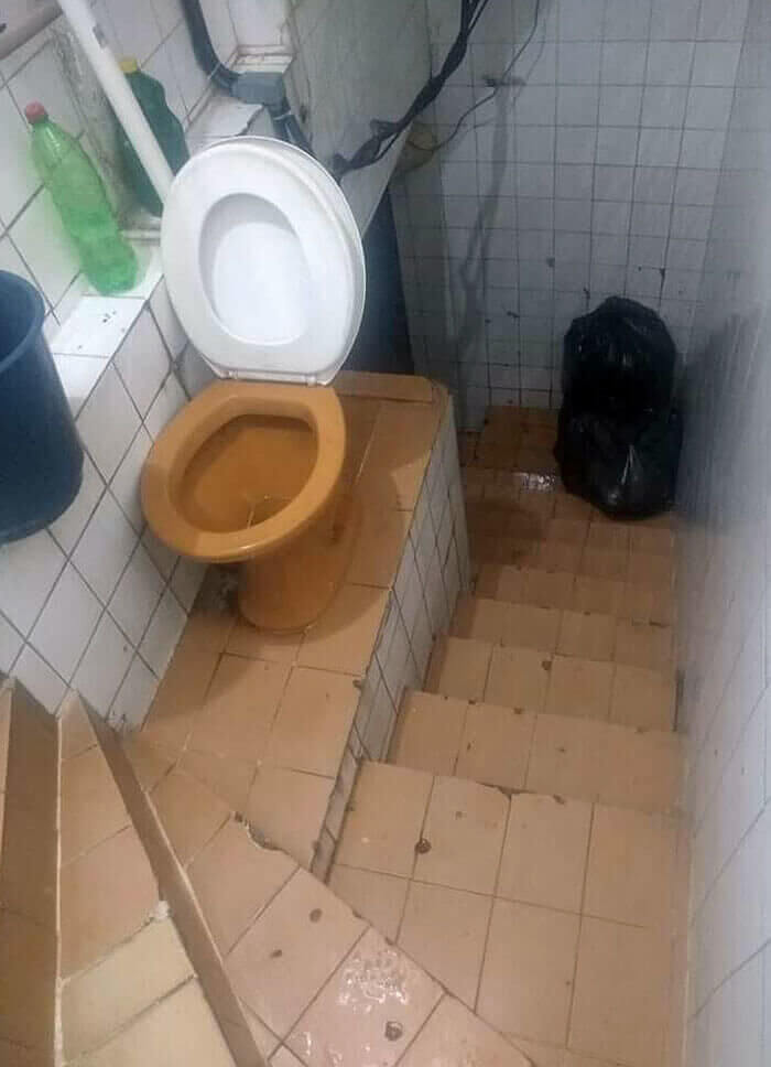
“We had some extra space in the stairway and weren’t sure what to do with it, so we went ahead and installed a toilet”. In our imagination, these words were spoken when describing the owner’s thought process for this unconventional pee pit stop. So many questions…
Because there is a large bag of garbage at the bottom of the steps, we can assume these stairs do get some traffic. Perhaps it is a business and these stairs lead to their dumpster. If that is the case, how could anyone use this toilet without any type of privacy? You just do your business as your co-workers pass on by? Aside from the privacy factor, this commode is also on the edge of a ceramic cliff with only darkness below. No sir, no thank you.
A Puzzling Pass-Through
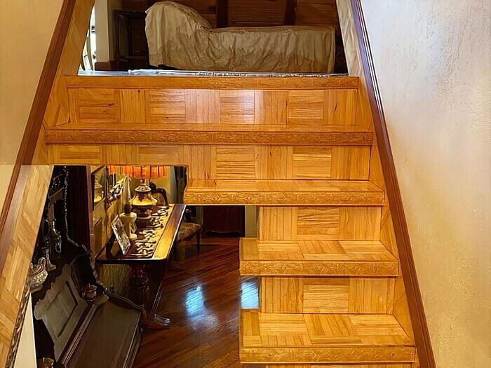
While it is apparent that this stairway renovation was done to create a pass-through to the room below, the extreme cuts have left a somewhat treacherous pathway. Even the most balanced and sober individual will have issues when attempting to climb these as the stairs themselves are narrow and there is no handrail in sight.
So, just imagine how difficult this climb would be if you were intoxicated or in a groggy fog. If you are the unlucky one who gets assigned this guest bedroom, our advice to you is to sleep on the couch.
An OCD Nightmare
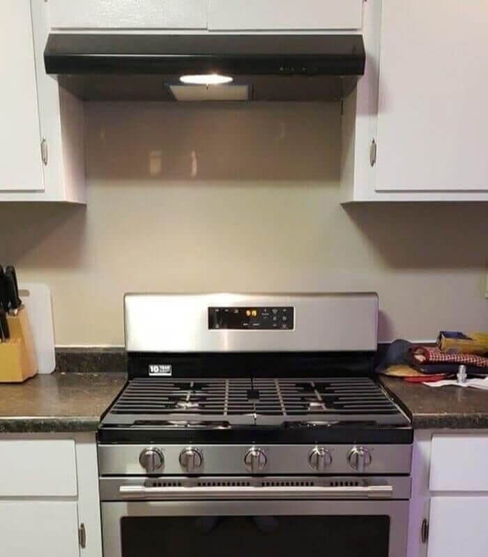
This OCD nightmare screams renovation shortcut and will have potential buyers running for the hills. We understand trying to save some money by updating your existing cabinets but if you are planning to add new appliances, be sure to measure, not once, not twice, but at least three times to make sure of the dimensions.
Otherwise, you will end up with something like this. The stove and the vent do not line up and it is painfully obvious. Even people living without OCD will be annoyed having to stare at this off-centered fiasco every day. Unfortunately, this isn’t a cheap fix either. They will either have to remove the vent and add extra cabinets or shift the stove by replacing a cabinet and adjusting the countertop.
A Confusing Entrance
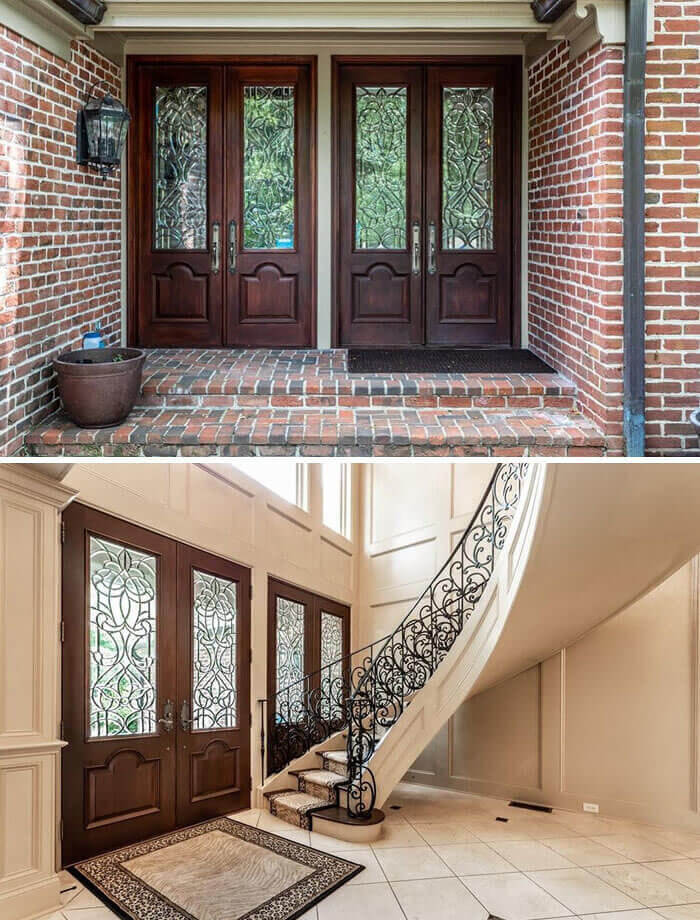
While having one faux front door and one real one may deter traveling salesmen, having two entrances can also be quite confusing when the guests you actually like arrive at your home. As you can see from the interior photo, the door behind the staircase isn’t functional so it is bewildering that they would design this high-end home this way.
This was most likely a mistake made by the architect or the contractor, either way, the homeowner should hold them accountable and have this design flaw corrected. For now, they have opted to provide a doormat clue to those who wish to enter.
A Plethora of Interests
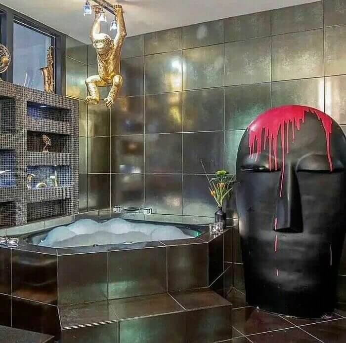
Personal style will typically reflect a person’s interests so when we saw this photo, we knew this house belonged to one unique individual. If you strip away all of the decor, you have a well-done modern bathroom made with high-end materials, right? So what is it about these decorations that take this bathroom from tasteful to tacky?
Let us begin with the giant head, its sheer size is already off-putting so when you add the blood splatter it becomes somewhat disturbing. And then there is the golden chimp hanging over the bathtub. Why? Yes, he is a whimsical guy but probably not the best bathroom decor. We must also mention the random saxophone gathering dust on the top shelf above the tub. Will it be played while having a soak? All in all, it’s the hodgepodge of random items that send this design over the top.
The Blind Spot
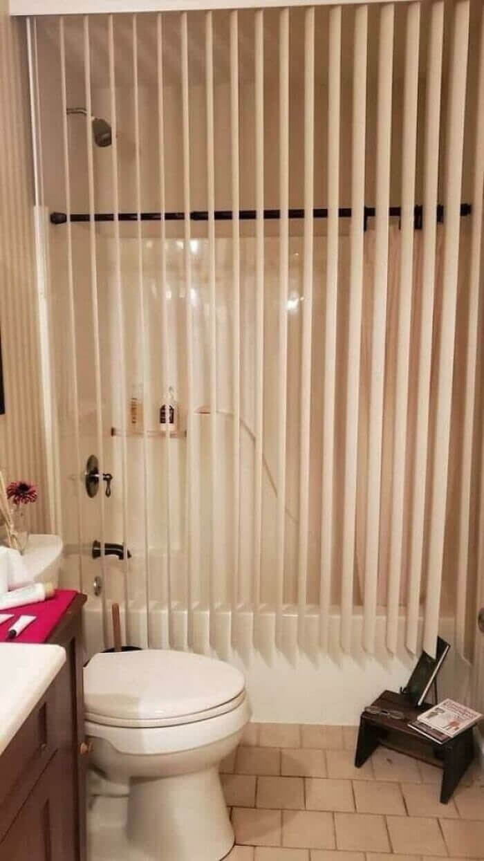
Now, we are all about repurposing items in your home so they don’t go to waste, however, if you are going to use one item for another purpose, make sure it will function in its new role. This hack is a first for us. Instead of utilizing their installed shower rod by buying a curtain, this creative homeowner repurposed their vertical blinds in hopes of keeping the water off of the floor.
Because vertical blinds have a tendency to sway, the likelihood that they will keep the water in the tub is slim to none. With that said, should the owner want a bit of privacy while taking a bath, the blinds are the perfect choice for this bathroom’s decor.
Functionality Failure
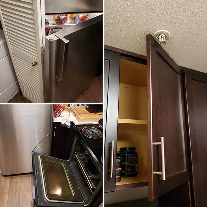
This homeowner’s kitchen is a perfect example of what happens when contractors and architects don’t measure. As you can see, we have some pretty drastic functionality failures here. If the door to the laundry area is open, the refrigerator door is blocked. Because the appliances are too close together, the oven door is scraping the front of the fridge. Oh, and our favorite, the cabinet door can only open so far because the sprinkler was installed in its way.
These are quite honestly rookie mistakes that could have been easily avoided. Even so, the damage is now done and there is no fix in sight unless the homeowner is willing to pay for another renovation. Ouch!
Tooth and Lace
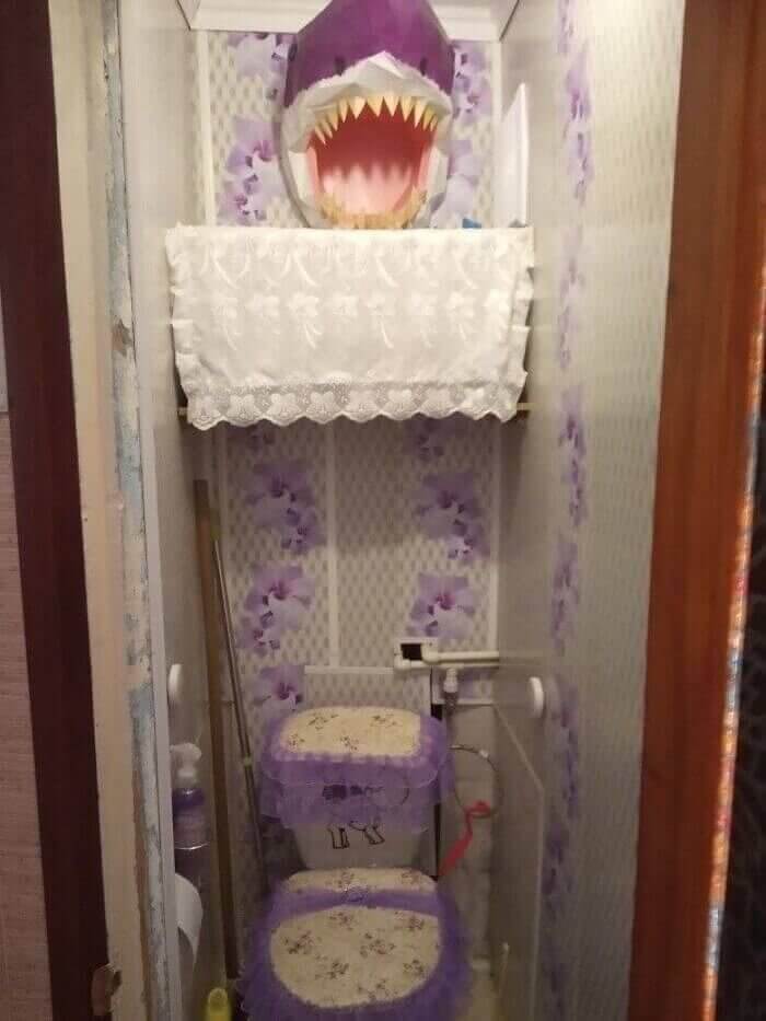
Do you know how you can get a feel for a person’s style the moment you enter their home? It may feel traditional or modern, warm or cold, cheerful or sullen, there are certain indicators that allow you to pinpoint it. That is certainly not the case with this space, we have no idea what their design aesthetic is, other than schizophrenic.
At first glance, this room makes you think that the owner’s preference is lace and flowers, pretty things, right? Then your eye heads towards the ceiling and you notice a great white shark lunging towards you from the depths of the wall. The only thing we can ascertain is that purple is their color of choice. It looks like Barney threw up in there.
Deceiving Doorstep
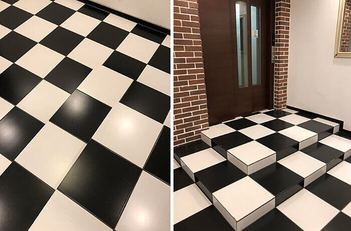
While it is quite interesting that the design of this entryway can trick the eye like an Escher painting, the actual steps can be quite deceiving. The pattern and the colors make them nearly impossible to discern so if you aren’t paying close attention, you could wind up on your backside.
It’s important to be aware of things like this especially when designing a common area with high traffic. Instead of creating an entryway that could potentially kill someone, it might be a good idea to design steps that are easy to recognize so people can easily climb them safely. Just a thought.
Nooks and Crannies
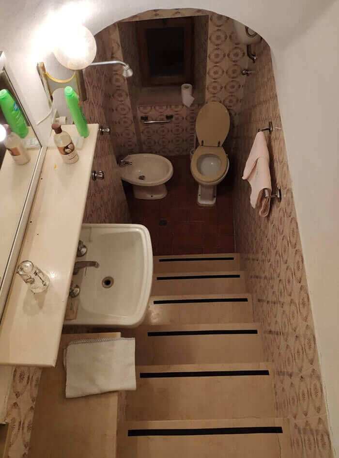
While it is true that adding a bathroom to your property can increase its value, it truly does depend on how well the renovation is done. Take, for instance, this water closet that was randomly added at the bottom of some stairs to nowhere.
Now, if done correctly, this could have been a value-added reno, however, choosing to place the sink on the stairs so they could add a bidet and a makeshift shower makes the room as a whole look unplanned. If you choose to add an extra bath into a nook or cranny of your home, you have to be realistic about what can actually fit into the space. This isn’t a selling point for buyers, instead, it’s a reason to walk away.
Spores on the Floor
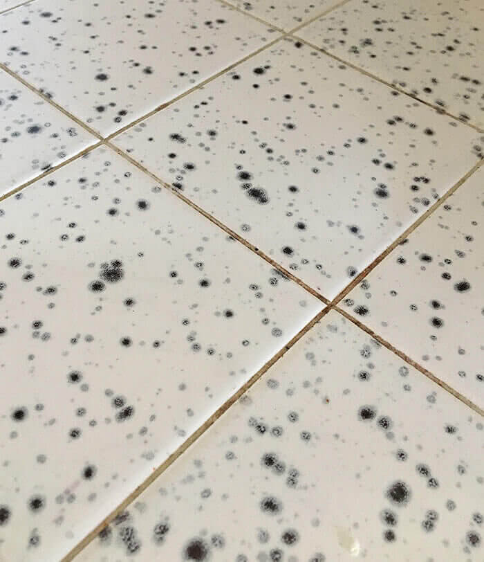
We are sad to say that you are not looking at actual moldy floors, these tiles were designed to emulate mold and we have no idea why. Yes, you read that correctly, these homeowners actually chose to display spores on their floors. Luckily, this hasn’t become a full-blown trend as of yet but it makes you wonder what the designer and the consumer were thinking.
Perhaps the person who bought it wasn’t a fan of cleaning. With these installed they could tell others that the floors aren’t dirty, they are supposed to look that way. Perhaps they installed this tile in their kitchen so it could camouflage the actual mold that was growing. No matter the reason, this is a design failure of epic proportion.
Living on the Ledge
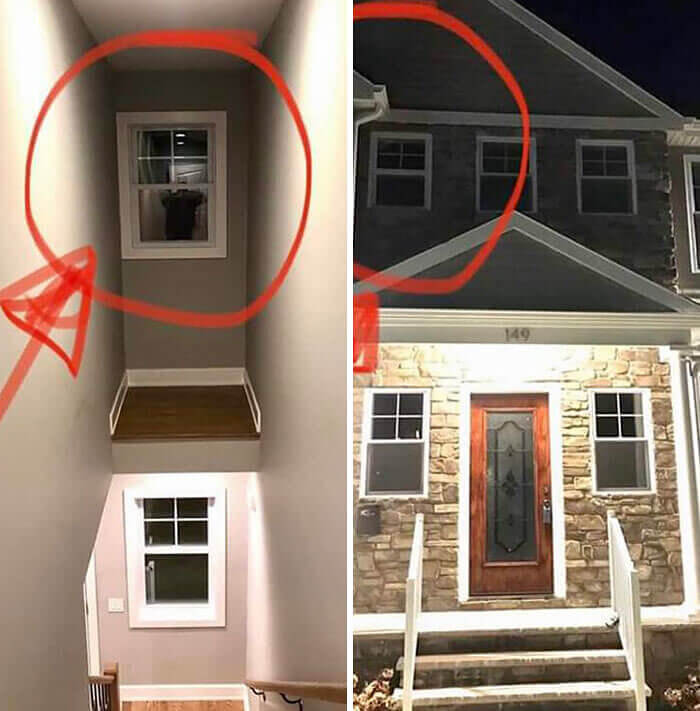
Though this is an absolutely lovely home, it has a very quirky feature that we just cannot figure out. On the interior of one of these windows is a tiny little ledge that seems to serve no purpose at all. Granted, if a prowler entered via this window, they would certainly have a rude awakening, however, we are pretty sure this ledge wasn’t designed for that purpose.
So what is the purpose? You can’t display a plant on it because there is no way to water it, you can’t store boxes there because it is visible from the common areas of the home, and you can’t really display decorations there because they will become dusty and covered in cobwebs. Unfortunately, we may never know.
The First Step Is a Doozy
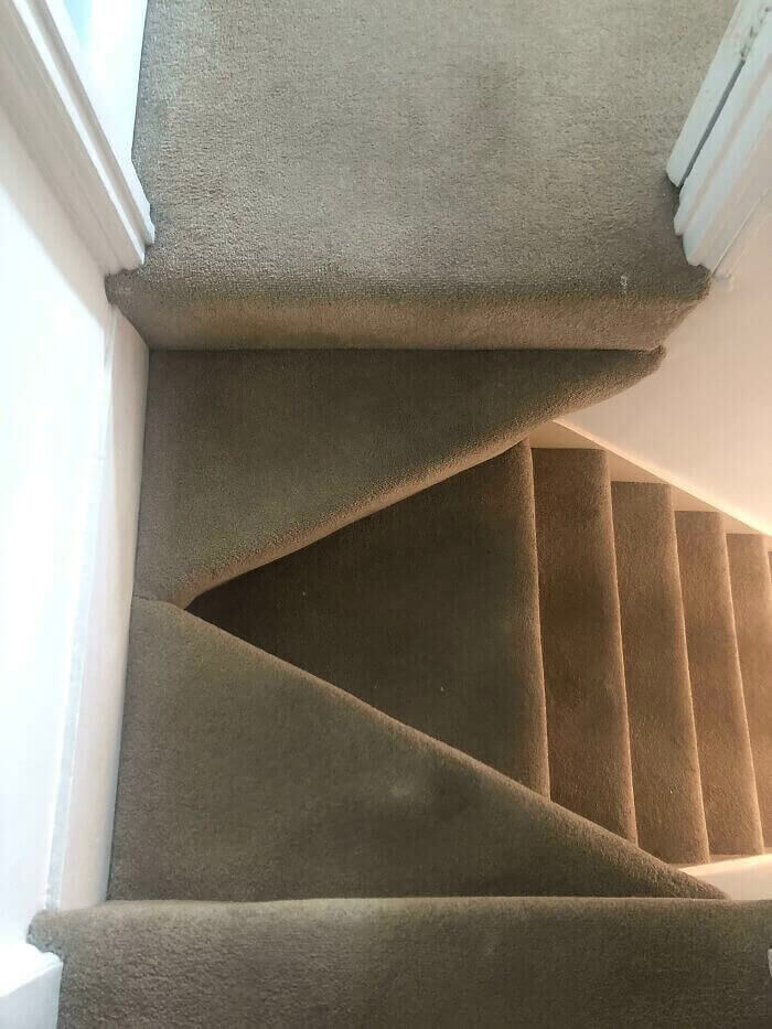
The first step of these stairs has us seriously scratching our heads. Why would they have designed two very narrow triangulated steps instead of building a solid, wide, and, most importantly, safe landing? It makes no sense whatsoever.
We get it, there are obviously two wings of the house that both have entrances to the stairs that are across from one another. Was this contractor so concerned that they each have their own step that he completely changed the norm for stair building? The hazard factor here is astounding, hopefully, the accidents are kept to a minimum.
Pretty In Pink
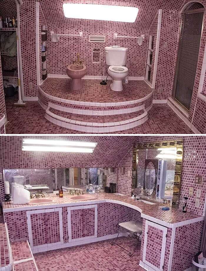
Though we can’t be sure, we are starting to suspect that this homeowner’s favorite color may be pink. Because this bathroom is so massive, the monochromatic pink tiles have a sort of dizzying effect. Aside from the chaotic walls, floor, and ceiling, the color scheme itself can be quite overwhelming for potential buyers (unless, of course, they are Molly Ringwald).
Though this seems to be more of a feminine bathroom, they have also chosen to put their porcelain throne on a pedestal right next to their bidet. Unlike the other throne pedestals we have seen, this one does have stairs that look relatively safe.
Dream Come True
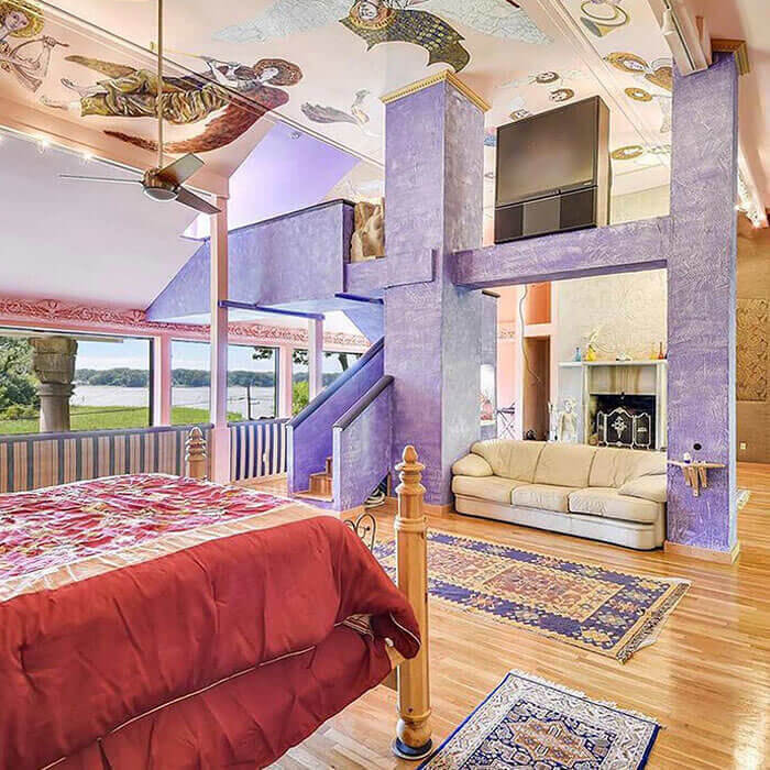
We have a sneaking suspicion that this home may belong to a recent lottery winner. Why, you ask? Well, it looks as though they have finally been able to afford everything they have ever dreamed of buying and combined them all in this room right here. Always dreamt of angels on the ceiling, check. Always dreamt of a white leather couch in my bedroom, check. Always dreamt of a massive television elevated for our viewing pleasure, check. You get the gist.
While their dreams may have come true, the room itself is a hodgepodge of 80s throwback decor. From the faux paint and wallpaper to the linens and furniture, this room is in dire need of a makeover.
The Devil’s in the Details
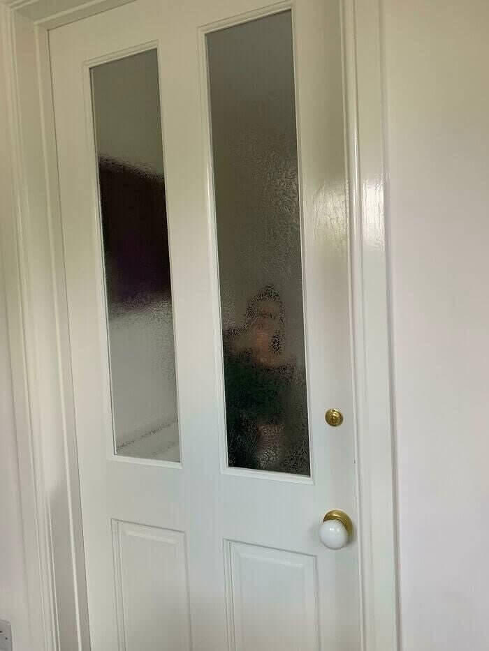
When house hunting, it is very important to observe everything. Though you may be excited and ready to jump the gun if you don’t pay attention to the details of a house you may find some features later that aren’t so appealing. Take, for instance, this couple. They bought their dream home after a rushed tour and soon discovered the door to the bathroom wasn’t up to snuff.
The previous owners had installed an exterior door complete with windows and a deadbolt for “privacy” in the master bath. Well, as you can see, it isn’t as private as the new owners would like. Luckily, there are solutions to this problem other than replacing the door, however, had they noticed this issue before the deal closed, they could have had the sellers pay for it.
The Toilet’s Wardrobe
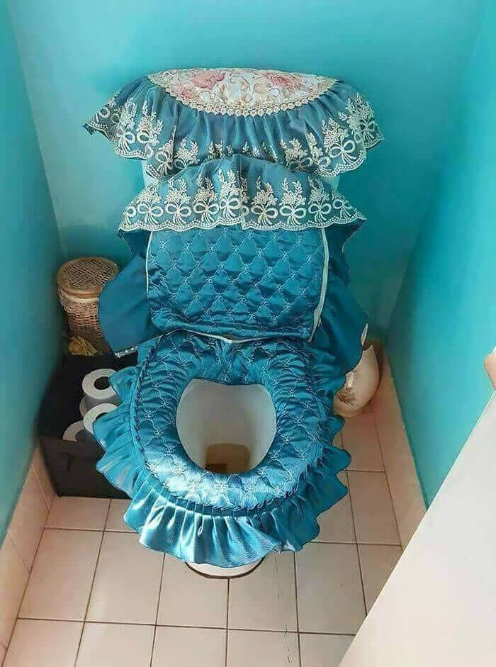
Well, isn’t this adorable? We hope you notice the sarcasm in that sentiment because this toilet’s ensemble is atrocious. Sadly, it is apparent from the photo that this homeowner needs a bathroom etiquette refresher. If you can’t be bothered to flush the toilet, we are pretty sure you aren’t aiming either. If you aren’t aiming then there are definitely germs all over this toilet cover.
Adorning your toilet with comfy covers was all the rage in the 1970s, however, the trend petered out when people began to realize how unsanitary it was. If you want to make a design statement in your bathroom, leave the toilet out of it. Decorate the walls, buy some nice towels or an area rug for the floor. Your toilet does not need a wardrobe of its own.
Going to Extremes
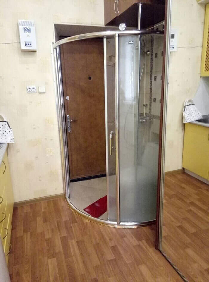
In this day and age with this crazy pandemic, this next unconventional home addition almost seems like a good idea. Almost. If you aren’t sure exactly what you are looking at, let us explain. The photo shows an exterior door that leads directly into the homeowner’s shower so when a guest arrives they can rid themselves of any germs before venturing further into the home.
In reality, this door was most likely installed so that people coming into the house from the pool area wouldn’t leave puddles of water on their way to the bathroom. While the concept is good, the execution in this home is lacking in style.
A Dirty Trend
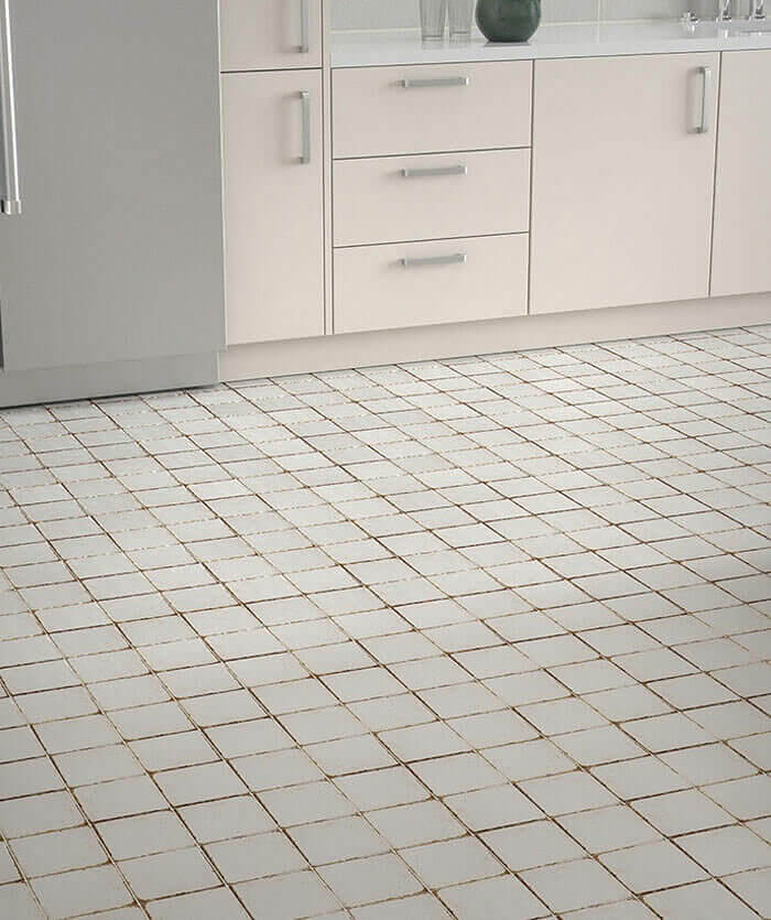
At first glance you might think that this floor requires a good cleaning but what if we told you that these tiles were fabricated to look old and worn? That’s right, you too can purchase grubby-looking tiles for your kitchen floor. While these may look a bit better than the moldy tiles, they still give off the impression that the house is grungy and dirty. So, why would anyone buy them?
We can only assume that there’s a market for these because of the worn and weathered trend that we have seen in the fashion industry. People pay good money to buy jeans and T-shirts with holes in them. They shell out $500 for a pair of Golden Goose sneakers which are produced to look weathered and worn. We know it sounds crazy, but as long as people are buying, designers will keep producing.
Boxed In
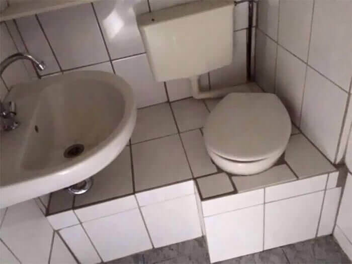
Our list would not be complete without one more bathroom design failure so here you go. We present to you the commode in the box. This handy ledge is perfect for your purse, coffee, some extra toilet paper, you name it, the ledge can hold it. In fact, the diagonal design of the toilet seat allows you to face the ledge for convenience. Well done.
All kidding aside, you have to wonder what this box is actually housing. Could mold be thriving in that dark, damp space? Could there be water damage down below? If you could actually detect any damage, how would you get to it? This design, or lack thereof, is not only an eyesore but also a plumber’s nightmare.

