With the advent of GPS, you might feel nostalgic and reach for an actual map to navigate like a true adventurer. But maps aren’t only good for navigation. The ones in our list showcase all kinds of interesting cultural facts about the US states—From the number of college graduates to the most-worn Halloween costume, each state has its own quirks and these maps will reveal them. Let’s take a look!
Coffee Craze
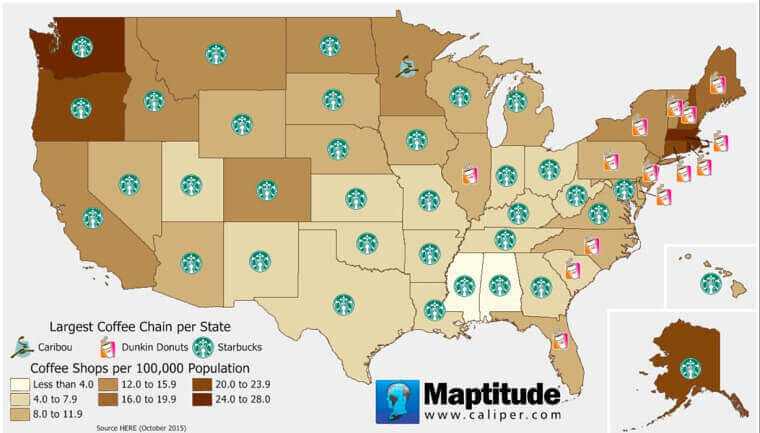
Most people are not fit for company until they’ve had their morning cup of Joe. We can’t blame them, a hit of caffeine really does turn a day from bad to decent. No wonder coffee chains such as Starbucks are absolutely killing it out there.
As this map illustrates, Starbucks is dominating the market in most American states. Although some states on the East Coast are still sticking to Dunkin Donuts. What’s weird is that the folks in Minnesota are the only ones who seem to prefer Caribou over all else.
The Bluest States
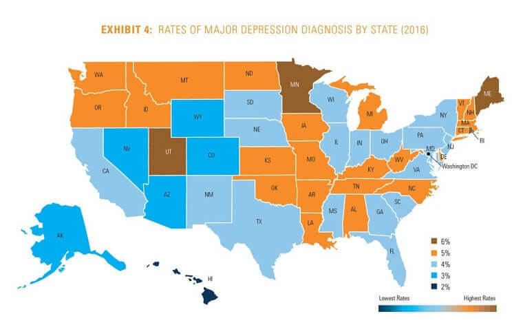
Whether you’re young or old, rich or poor, depression is a beast that doesn’t discriminate. America’s population isn’t far behind when it comes to mental health issues. This map shows the highest and lowest rates of depression within each US state.
One has to wonder what kind of socioeconomic and cultural factors influence the percentage of depressed individuals in a state. Are people from Alaska actually happier or are there fewer documented cases of depression because people prefer to suffer in silence? Only time will tell!
Seven Deadly Sins
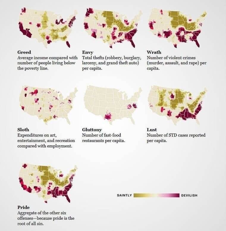
As humans, it’s hard to be completely free of all vices. There’s at least one deadly sin that we commit very often if not every day. This map reveals the state-wise distributions of America’s deadliest sins and habits. It shows which states are positively devilish and which ones appear saintly.
Based on statistics of violent crimes, STD cases, fast food restaurants, thefts, and income, we can map sins like wrath, lust, gluttony, envy, and greed. Pride is definitely the root of all evil so it’s determined by combining all the other sins.
The Worst Possible State Award Goes To…
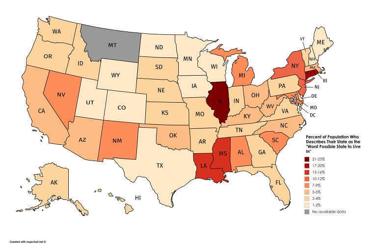
With different opportunities and amenities in each state, the area you live in largely defines who you are and who you’re going to become. While someone people love their state, others aren’t too pleased with where they live and are struggling to escape.
This map shows the percentage of the population who recognizes their state as the worst state to live in. So, what’s going on in Illinois? We can’t believe that almost 25% of the population of the state hates living there. Maybe it’s the noise pollution.
The Ghost of Schools Past
Saying that college education is expensive might be the understatement of the century. The costs of higher education, especially in America, are astronomical, to say the least. Don’t believe us? Just take a look at the amount of student debt owed from each US state.
Instead of celebrating their college graduation, students are now thrown into an endless pit of despair. Not only do they have to become functioning members of society, but they also have to pay crippling student loans or risk defaulting.
The Sound of Silence
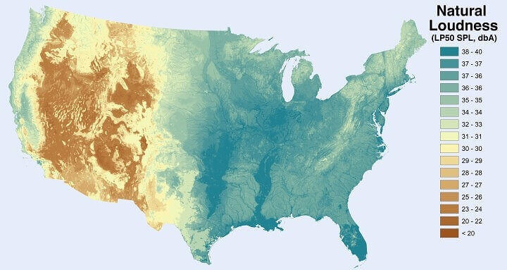
You may consider the organic sounds of nature to be silence but someone out there is measuring the loudness of nature and they have some interesting conclusions. After studying natural loudness, that’s measured by observing the sounds made by topography, scientists have come up with this stunning map.
This includes sounds originating from flowing bodies of water, vegetation, wind, and other natural noises of the wild. Clearly, if a tree falls and no one’s around to hear it, it still makes a noise and someone is surely listening.
Second Amendment Rights
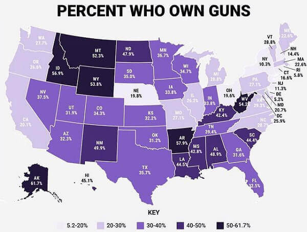
America is famous for its lax gun laws that lead to multiple catastrophic school shootings each year. We’re sad to start on such a terrible note but there’s no denying the impact of guns in America. This map shows us the percentage of Americans who carry guns.
As you can see, the Midwest is notorious for practicing its Second Amendment rights. Especially in Montana, Idaho, Wyoming, Arkansas, and West Virginia where more than half of the population owns guns. If you’re against guns, you might want to steer clear of these areas
Metropolitan Dreams
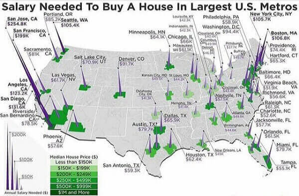
If you’re thinking of buying a house and your current salary doesn’t allow it, you might want to check out another state. This map shows exactly how much salary you need to buy your own house in the biggest metropolitan cities of the US.
Of course, New York’s and Boston’s notoriously expensive real estate requires you to have a paycheck of up to $106k. In half that amount, you could easily afford a nice house in warm and sunny Tampa Bay. Let’s not even talk about the West Coast where a property will cost you more than a few kidneys. Unless you’re a millionaire, you might want to steer clear of San Jose altogether.
Halloween Costume by State
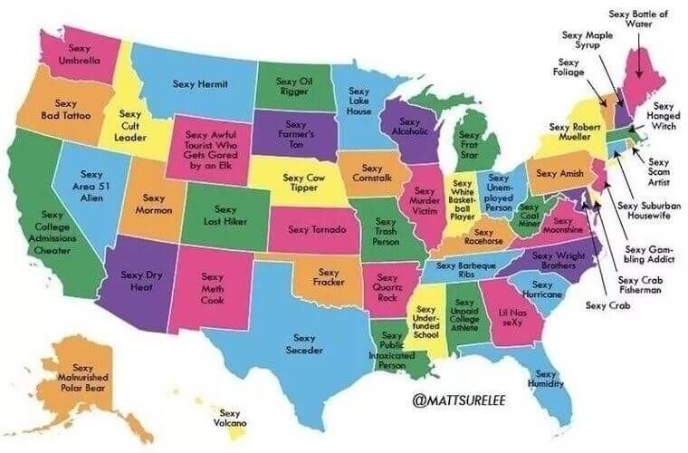
Halloween is one of the most popular holidays celebrated enthusiastically by people all over America and beyond. Apart from all the candy, one of the biggest charms of Halloween are the creative costumes. Of course, these costumes don’t necessarily have to be spooky.
In fact, many of them are more ironic and hilarious than scary. Here’s a funny map that assigns a Halloween costume to each American state based on popular stereotypes. We highly relate to Montana residents because who doesn’t want to be a sexy hermit?
Bringing Big Bucks
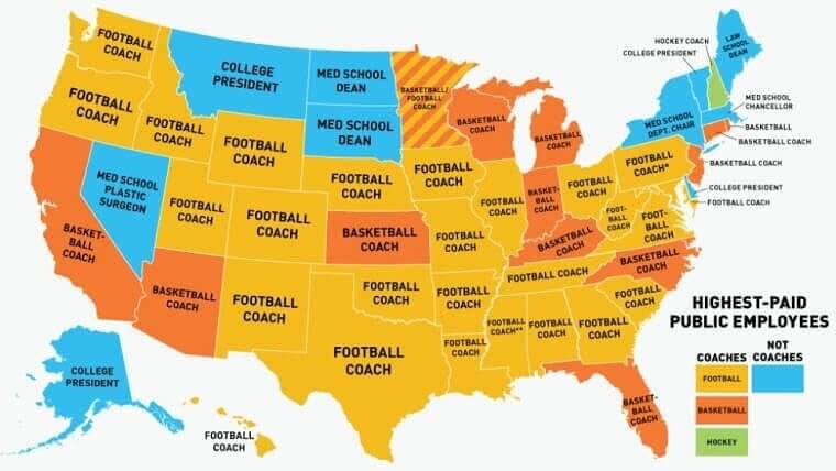
Do you ever wonder what the highest-paid public profession in America is? Here’s a map that’ll tell us exactly which public employees earn the most money in each state. We know it can’t be the teachers or the nurses. Well, it’s sports coaches. Why are we not surprised?
College football is a super hit sport in the country, with coaches bringing in 2.7 million dollars per year on average. Even the average salary of your neighborhood high school basketball coach is $45K a year which is more than most public employees.
A True Epidemic
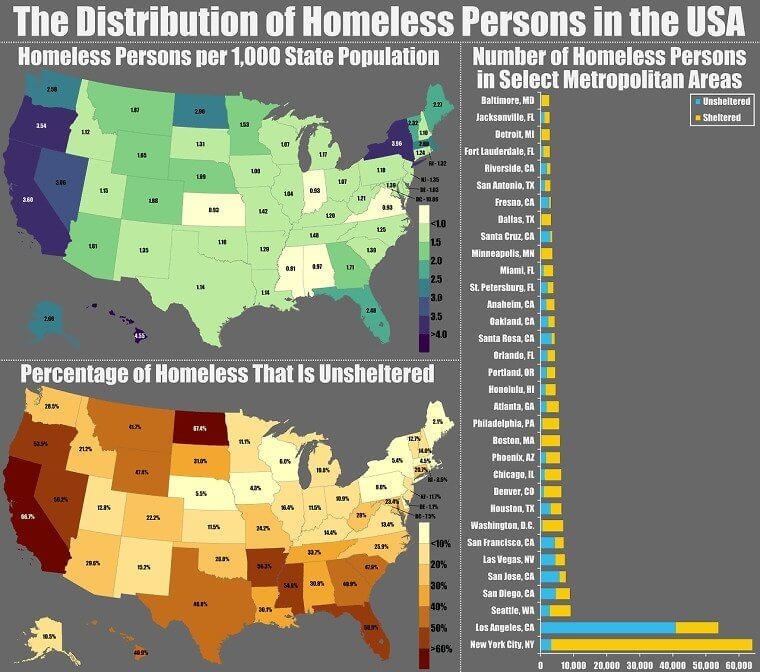
When people say America has a homeless epidemic, they’re not lying. Here’s proof of how prevalent homelessness is in the country these days. Unfortunately, with rising prices and inflation, things just seem to be getting worse.
As you can see, there are more than 150,000 people on the streets in California alone. New York comes a close second with a homeless population of 100,000 individuals. Add that together and you get almost a quarter million people living on the streets in just two out of the fifty states in the US.
American Ancestry
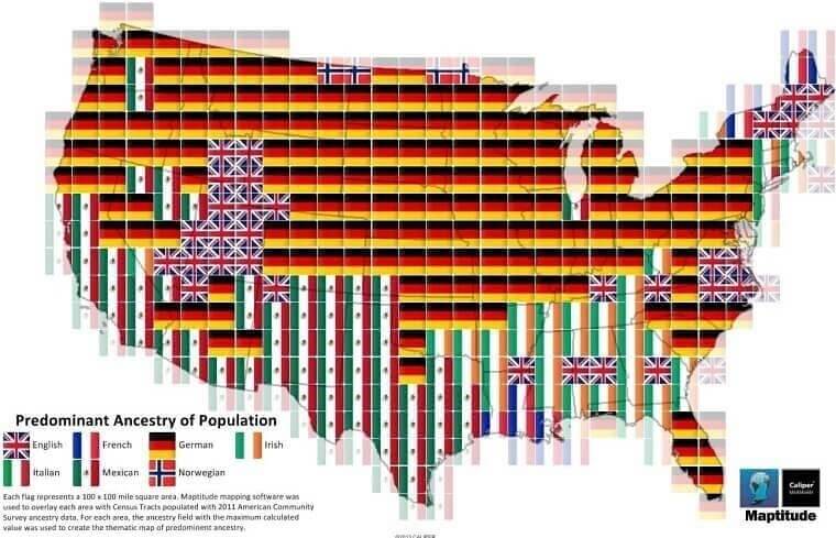
Once upon a time, some immigrants discovered new land and the rest is history. That’s how America came into being. Naturally, most Americans today are descendants of immigrants from other areas. This map shows the predominant ancestry in each American state.
Between 1820 and 1930, around six million Germans and four and a half million Irish immigrants headed over to America from Europe to turn their lives around. Most Americans are descendants of these immigrants including Italians, Mexicans, and English people.
Top Jobs for Immigrants
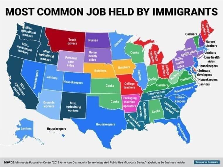
Thousands of people head to America for a better quality of life and grand opportunities. That’s the picture painted by the American Dream. The reality isn’t always that easy or glamorous. As the map shows, most immigrants are working-class people, with service-sector jobs.
They make up a majority of the truck drivers, janitors, nurses, housekeepers, cooks, and other maintenance staff in the country. Of course, there’s nothing wrong with working in the service sector, in fact, these are the people who run America behind the scenes. We’d be lost without them!
The Biggest Apple
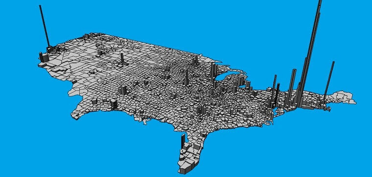
If you needed another reassurance of the fact that New York is brimming with people, this is it. Here’s a 3D map of America’s population density. This can be calculated by determining the number of people who live in a certain area.
Population density is an important metric that’s used for urban planning, policy changes, and many other important decisions. Ironically, New York’s population density towers over others just like the tall skyscrapers in the state. Another population spike can be seen on the West Coast around the state of California.
Drunk Dining Is Not A Crime
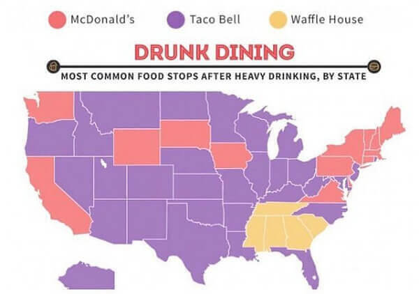
Drunk driving may be a crime but drunk dining isn’t. In fact, we encourage inebriated folks to have a hearty meal, that’s why there are so many fast food chains in America. If you’re planning to get wasted this weekend, here are some suggestions.
As you can see, Taco Bell wins this one fair and square. There’s just something about eating Taco Bell after a crazy night out. Mcdonald's also made the list along with a nice breakfast at Waffle House. What’s your drunk dining restaurant of choice?
Long Living on the West Coast
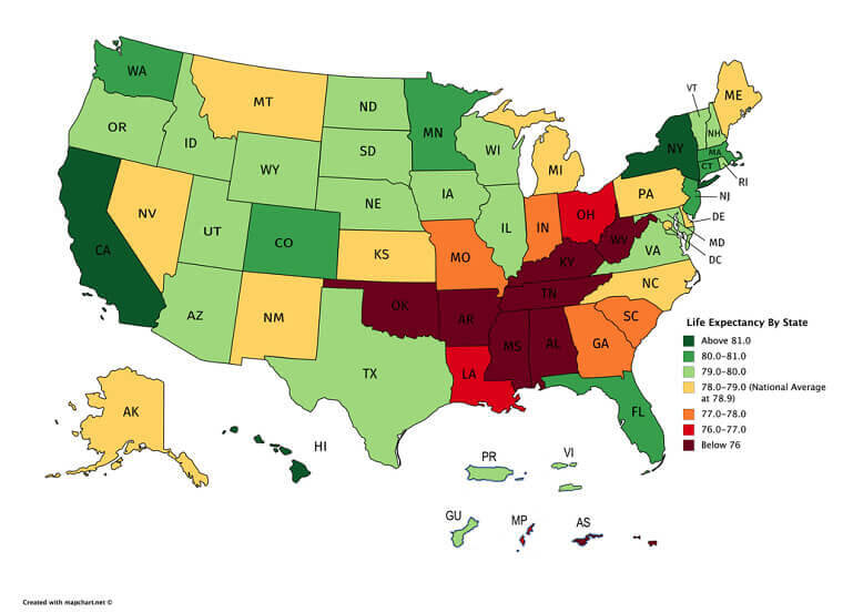
One of the biggest wonders of living in the age of scientific advancement is that we live longer lives. Due to medical leaps, humans have increased their quality of life and expectancy. Here’s the life expectancy of Americans in each state.
Sunny California and Florida are leading the way with a life expectancy of more than 81, that’s above the average life expectancy that lies at 79. States in the Midwest, however, seem to have a below-average life expectancy that lies below 76.
Rent Is Due
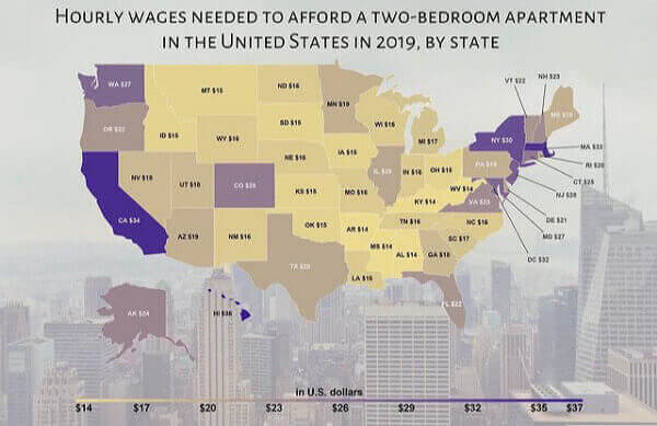
When people joke about the shoebox-sized apartments they’re spending a fortune on in New York, they’re not kidding. In big states like New York and California, a two-bedroom apartment can cost an arm and a leg.
This map shows exactly how much your hourly wages should be in order to afford a two-bedroom apartment in each state. Unless you have an hourly income of $37, you can forget about living in New York and California without one or multiple roommates.
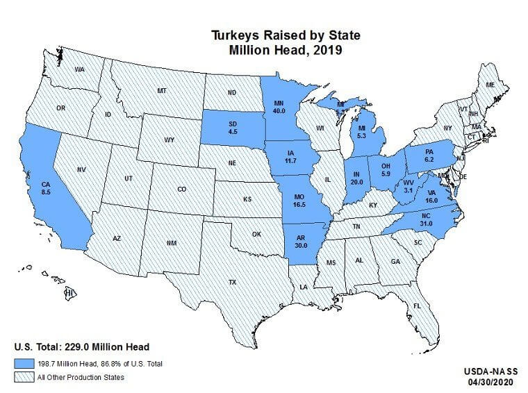
Turkey per Head
Before the Christmas season starts in full swing, there’s another traditional holiday Americans love to celebrate. It’s an occasion to count our blessings and remember all that we’re thankful for. Yes, we’re talking about Thanksgiving!
There’s another important facet of Thanksgiving apart from overwhelming gratefulness. It’s the part where we stuff our faces with a scrumptious Turkey dinner. This map shows exactly how many Turkeys are produced in the US every year. We guess Turkey farms are just another blessing to be thankful for.
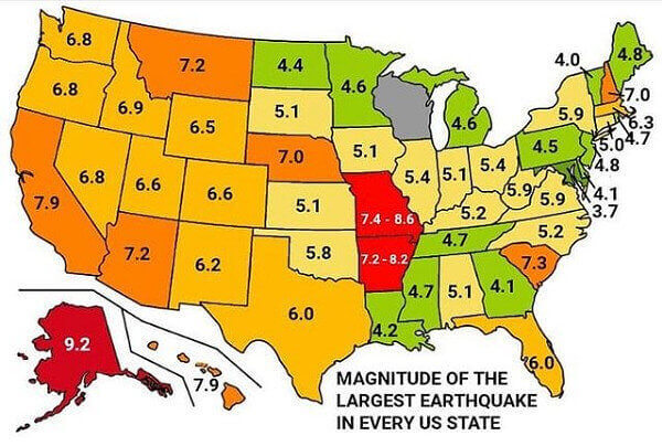
Shake It Up
The West Coast may be full of exciting opportunities but this map shows exactly why you may want to steer clear of the States that come under it. Whether you live in chilly Alaska or warm California, you’re still bound to experience an earthquake.
The map shows how the state of Alaska has the highest recorded magnitude of earthquakes at 9.2. Missouri and Arkansas follow closely behind with high intensities of up to 8.6. So, before you move to another state, make sure you research all about the frequency and intensity of earthquakes experienced there.
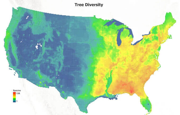
Trees Come in All Shapes and Sizes
Apart from its diverse population, America is also home to more than thousands of species of trees. Here’s a map that shows us exactly how many tree species exist in each region of the country.
As you can see, the Eastern coast boasts close to 138 different types of trees, a truly diverse ecosystem! Of course, the West coast promises its own collection of unique vegetation and trees for those who’re interested in exploring them.
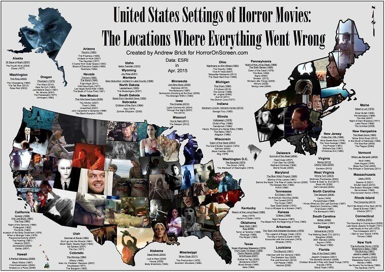
American Horror Story
If you’re a connoisseur of horror films, you’ll love this interesting map. It shows each American state where a horror movie was set. From The Shining to the Texas Chainsaw Massacre, there are many classics on this map. How many have you seen?
To be fair, the Midwest section looks particularly terrifying and features many slasher flicks. If you love horror movies, you might just find many new recommendations for your next spooky movie night. We know we’ve got a few of these we need to catch up on!
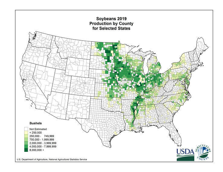
The Rise of Soy
Due to the rise of veganism in America, a lot of residents have ditched dairy products to embrace more ethical options. One of the most popular alternatives for dairy is soybeans which give us everyone’s favorite soy milk.
With the increasing demand for soy milk, American states have upped their production of soybeans. This map shows exactly where our precious soybeans are sourced from and then turned into delicious soy lattes. It’s evident that Iowa, Illinois, and Indiana are winning in the soybean production race.
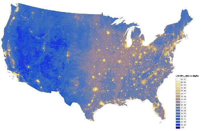
Noise Pollution
Our previously mentioned map of natural loudness revealed that East Coast makes the most natural noise. Let’s take a look at which areas have the highest natural plus manmade noise pollution.
This stunning map shows what we already know, metropolitan cities never sleep. Just take a look at New York, San Francisco, and Los Angeles. Yet again, the East Coast turns out to be the noisiest region in America. If you’re looking for some peace and quiet, a nice small town in the Midwest might be your best bet.
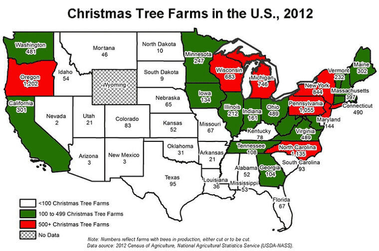
Jingle Bells
Christmas wouldn’t be complete without a beautiful tree under which Santa can leave his gifts. Even picking the perfect tree is a family tradition. That’s why opening up a Christmas tree farm is great for business.
Don’t believe us? Just look at how many tree farms there are in the US! Can you believe that New York has more than 500 of them? Well, it does. On the other hand, the Midwest is strangely bereft of too many tree farms. Maybe there’s some untapped potential there.
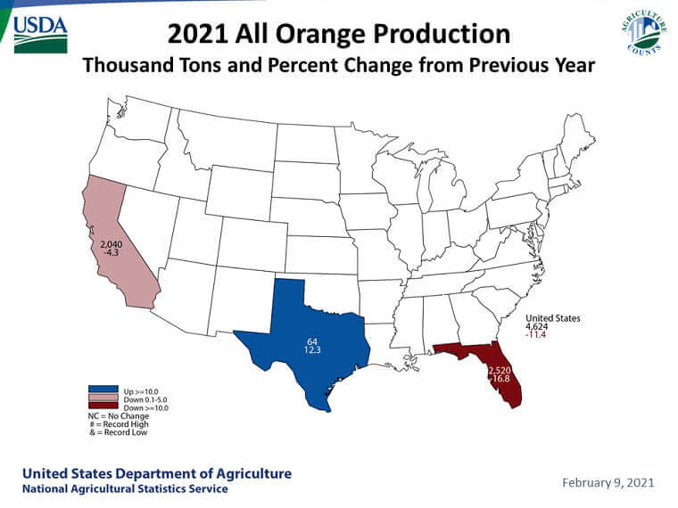
For Orange Juice Enthusiasts
Whether you love the refreshing taste of some orange juice or drink it for your dose of vitamin C, OJ is a staple in the American diet. For people who do consider it a must in their diet, here’s a map that shows the percentage changes in orange production all over America.
Released by the United States Department of Agriculture, this map depicts that California, Texas, and Florida are the only states producing oranges in the country. Out of those three, only Texas has managed to boost its orange production in 2021.
The Prison System
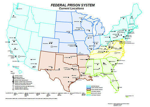
Unless you work within the prison system or had the misfortune of being in an American prison, you probably don’t know much about it. Here’s a map that shows exactly how the federal prison system is set up all over the country.
As you can see, there are quite a lot of federal prisons in America. One has to wonder what kind of funding it takes to run such a huge network of prisons. Not to mention, all the funds generated from the free labor of the inmates.
Acquiring America
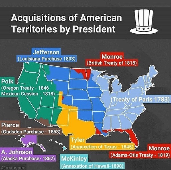
US Presidents may have become somewhat of a meme lately but there was a time when they were laying the foundations of the country. This map gives an overview of past US presidents and the American territories acquired by them.
It all started with the treaty of Paris in 1783 and the rest is history. Starting from Thomas Jefferson who acquired Louisiana in 1803 to the annexation of Hawaii in 1898, expanded as each president took over more territories. Today the country has 50 states and covers an area of 9.834 million km².
Introducing Each American State
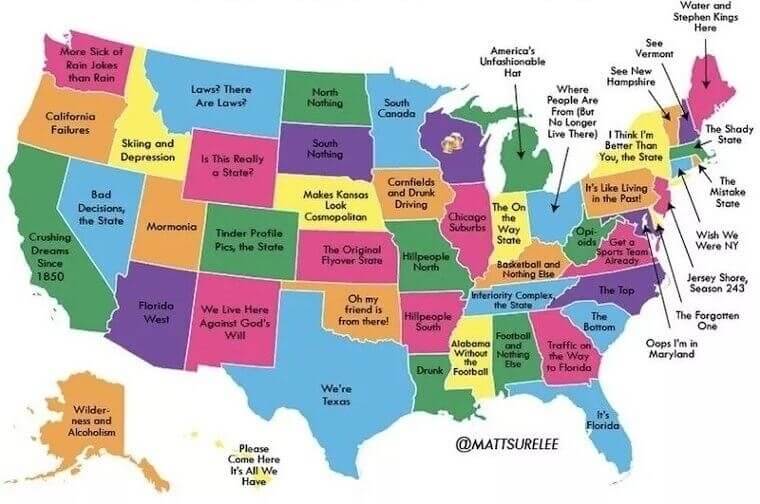
Non-Americans are always fascinated by just how many states the US has. And we get it, because 50 states is a bit too much, even for a large country like America. So, if you have a hard time remembering all the states and what they’re most famous for, this is the map for you.
Of course, all of this is in jest but we do believe this map is great for giving some cultural insights, as stereotypical as they may be. How accurate do you think this map is?
Some Dark Humor
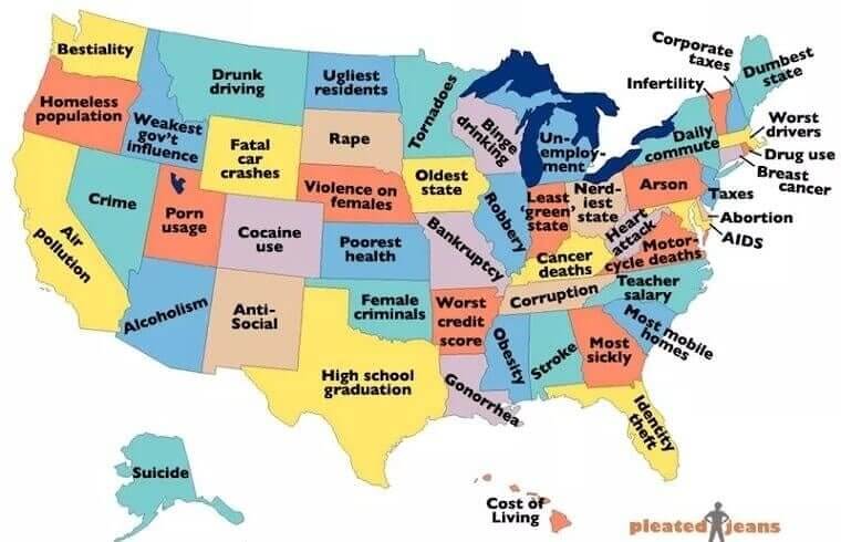
We’ve talked about all sorts of legit maps marking population density and orange production. Now it’s time for a silly one that makes fun of each state. Of course, it’s all in good fun so no offense is intended to the residents.
This borderline offensive map basically shames each state for the worst part about them. We have to say, it’s pretty dark and brutal. If you are brave enough, you can share it with your friends in other states and see if they agree. So, do you think this map is accurate, or total trash?
The Land of Fast Food
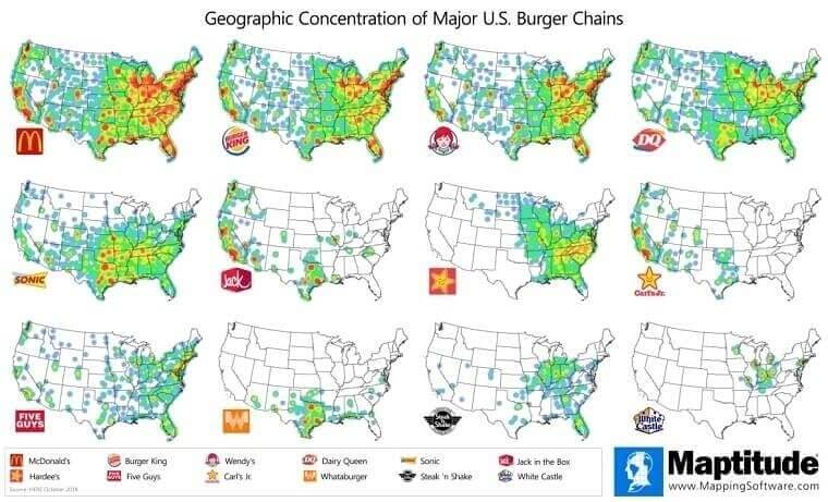
If there’s one thing America is famous for, it’s our fixation with fast food. And there’s nothing more popular in the US than burger chains. This map shows us exactly how many fast food restaurants from each franchise can be found all over America.
As you can see, old McDonald’s is the clear winner with Burger King coming as a close second. Wendy’s and Dairy Queen follow closely behind. Surprisingly, Sonic burger may not be too popular on the West Coast but it seems to be doing exceptionally well in Texas.
Happy Families
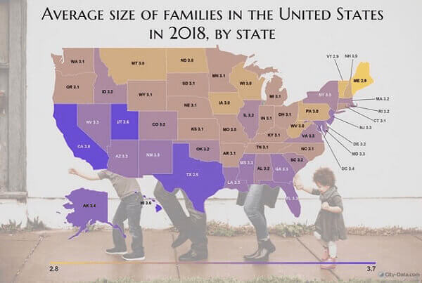
So far, we’ve learned where the most oranges, eggs, and soybeans come from. After a long journey of learning all about the nitty-gritty of each state in America, it’s time to dig into the size of American families. This is a map of the average family size in each state, as of 2018.
We’re not surprised to see Texas and California leading the race with the biggest families in the country. Other populous states such as Florida and Arizona follow closely behind.
Sunny Side Up
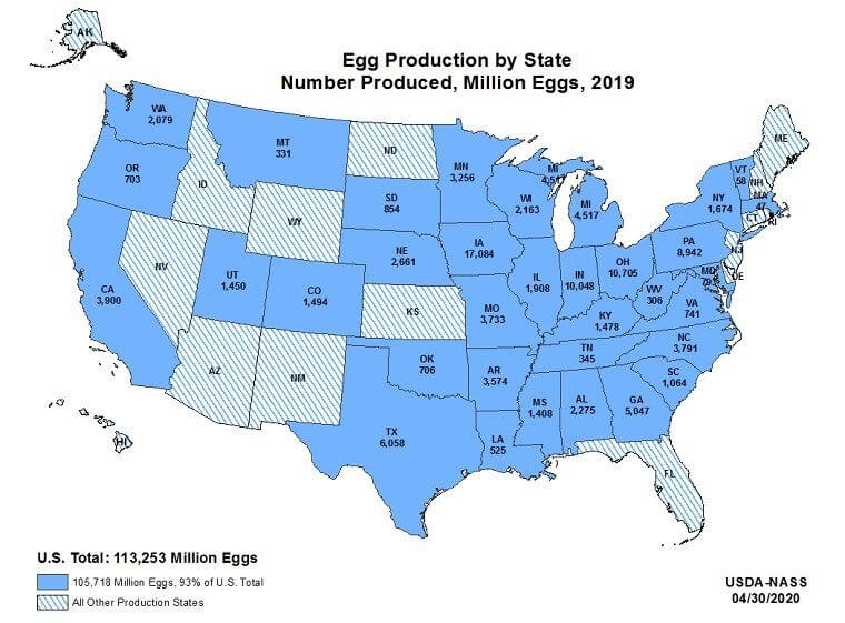
When it comes to everyday food items, nothing is as versatile as eggs. That’s why the demand for eggs will always remain high. This map shows how America is addressing this ever-present demand for eggs.
Overall, America produces fifty billion eggs each year with Iowa leading the egg production of the country. Did you know? Brown eggs are laid by red-feathered hens that have red ear lobes. On the other hand, white eggs come from white-feathered hens. So, how do you like your eggs?
Soviet Entry Declined
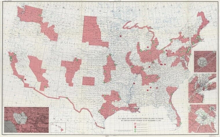
After the Second World War, when the world realized the terrifying potential of nuclear energy, America and the Soviet Union fell into a cold war. During this time, Russians had trouble leaving the Soviet Union and their activities were closely monitored.
Until the cold war ended, Russians needed to seek permission from the Soviet Union to get out of the country. Even after that, they were barred from certain places. All the places marked in red are areas in the US where Russians weren’t allowed until the end of the cold war.
A Soda by Any Other Name
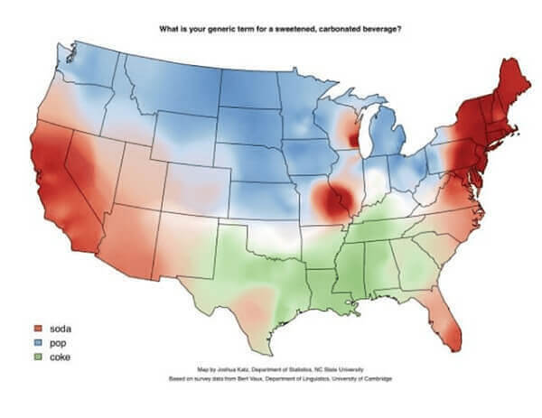
It’s interesting to see how people refer to different things in everyday life. Whether it's chips or crisps, biscuits or cookies, there’s no wrong or right way to say something. The region you live in determines what you end up calling certain things.
Even something as simple as carbonated drinks have several different names in America. Soda, cola, pop, or coke, there are many names for fizzy drinks. But as they say, a soda by any other name would taste as sweet.
The Origin of American Names
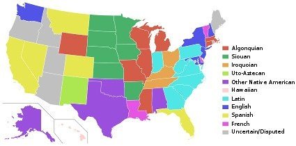
Have you ever wondered where our names originate from? While your American name might not hold meaning today, you might find its meaning when you trace back its origin. This cool map shows us where the most common names from each state are from.
Unsurprisingly, most of the names in the US originate from Native American words. America was originally theirs after all. The most unexpected revelation is that less than a dozen small states including New York and New Hampshire have predominantly English names.
Speed Limits per State
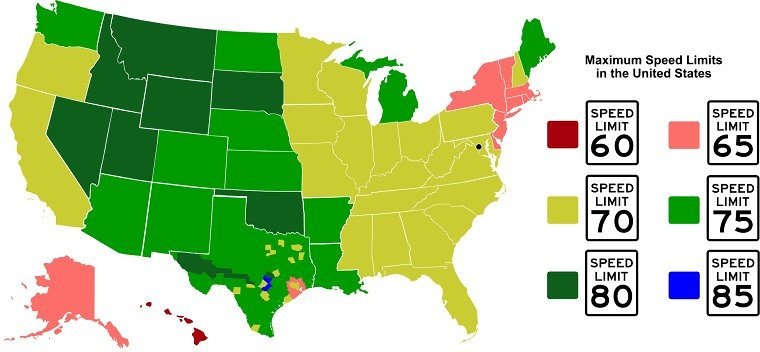
Nothing beats the feeling of zooming across an empty highway with your windows down and music up. As good as it feels to feel the wind in your hair and the car speeding up on the road, it’s important to ensure road safety by following the right speed limit.
This map shows us the maximum speed limit followed in each state. While the limits are more or less the same, it’s better to confirm the speed limit before you get on the road. You don’t want to get pulled over for a ticket after all.
Presidential Resting Places
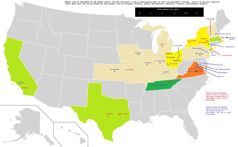
If you’re interested in the political history of America and the powerful men behind it, learning all about American presidents is a must. The Presidents who are no longer among us are buried in 18 different states all over the country.
This map shows exactly where they lie today. While many of them have been buried in the Arlington National Cemetary, some of them can be found in their hometowns. These former Presidents may be gone but the impact they had on the country and its people will never be forgotten.
America for Non-Americans
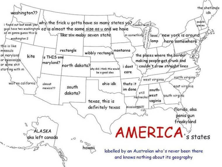
It can be difficult to pin down the confusing geography of America, especially for someone who doesn’t live in the country and hasn’t studied it in middle school. Here’s a hilarious depiction of how difficult it can be to remember all the states and their correct locations on the map. This Australian seems to be regretting their decision to label a map of the US.
We love how they immediately knew where Texas and Florida were. Also, we have to agree with them, why does America need so many states? 50 is a bit much if we’re being honest. Fun fact: Australia is almost as big as America but it has only six states!
Organic Living
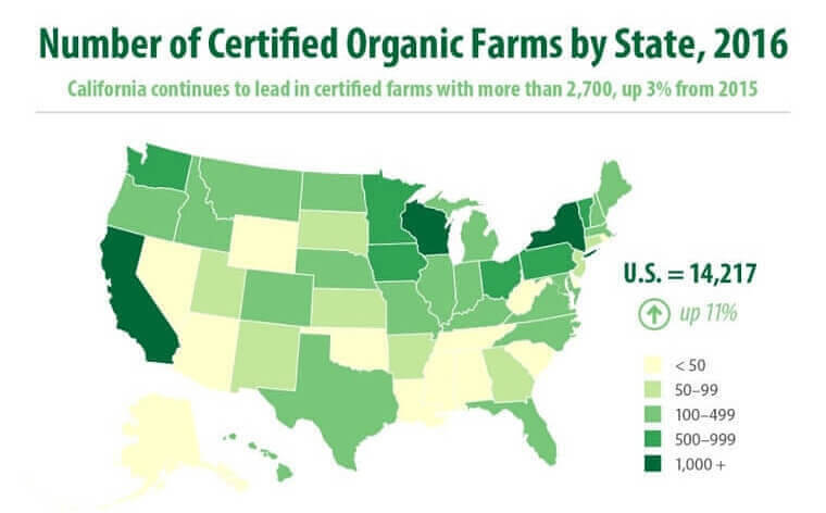
The wellness revolution has overtaken America with most people opting for organic ingredients over processed foods. This has gone hand in hand with many people embracing veganism and a clean and green lifestyle. For those who’re all about that organic life, here’s a breakdown of all the organic farms in the state of America.
Predictably, California seems to be the leading organic food producer with the most certified farms in the country. While organic food does tend to be highly expensive, at least you know you’re not ingesting harmful pesticides.
Land of the Cows
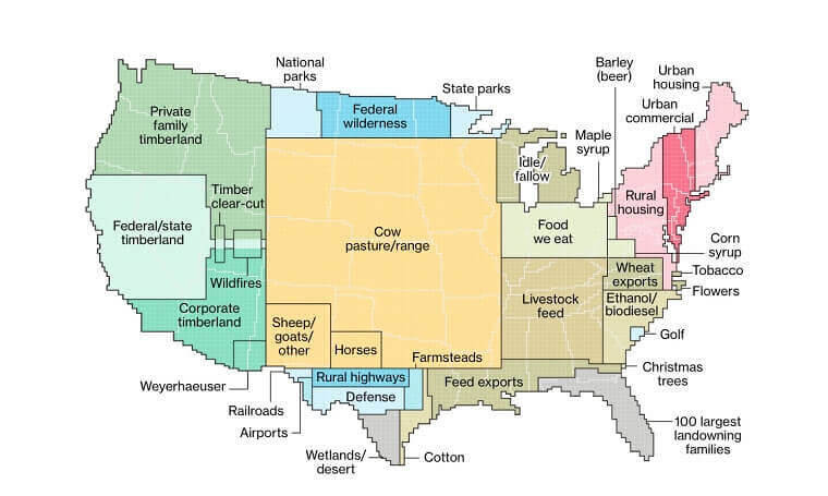
We’ve narrowed down everything from orange production to soybean-making states, it’s now time to see the land distribution of each state. This map depicts just how much land in each state is dedicated to certain activities.
It’s clear that a large part of American land, especially in the Midwest is dedicated to cow pastures and ranges. That’s where all the beef and dairy come from after all. Other major areas belong to feed for livestock, the food we eat, and family-owned and corporate timberland.
The Hitchhiker’s Guide Across America
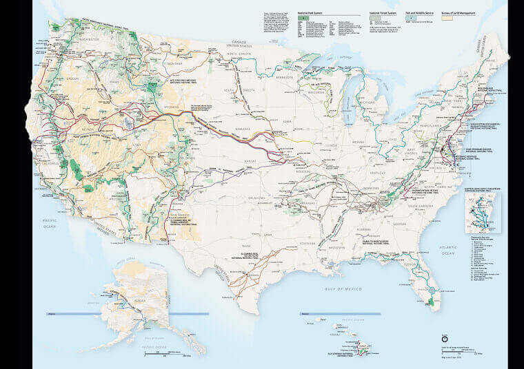
The American Dream may be smoke and mirrors but the terrain in America is surely a dream come true for many. Whether you prefer sandy beaches or stunning snow-capped mountains, the country offers many diverse landscapes.
There’s a reason why most young Americans set out on a journey of self-discovery across the country. It teaches you how to be one with nature and survive in the big wide world out there. So, what are you waiting for? Head out on an adventure of your own but don’t forget your trusty map!
Overloaded
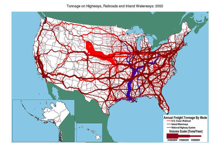
The railroads may have been the main channel for moving supplies across America for 200 years but they’re no longer working as they did in the good old days. The glory days of the railroad may be over for good thanks to better highway networks and inland waterways.
As this map depicts, most of the domestic goods are supplied through waterways and highways. Clearly, the developments in the natural highway have made it a more accessible channel. The railway simply doesn’t reach as many places as the road networks.
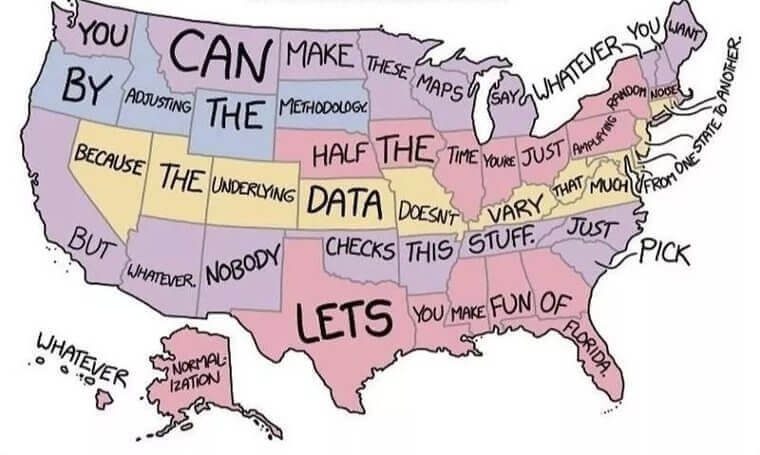
Word Vomit
Words hold power and so do maps – when they’re not fake, that is. This map of the ‘Most used word in each state’ seems pretty legit until you figure out what it actually says. So, what do you think this map is telling us? Certainly not that people in Hawaii love the world ‘Normalization.’
If you’ve decoded the “secret” message of this map, you know it’s a hilarious dig at these random maps that show up all over the internet. Anything can look believable when you put it on a map, even when it’s simply a generalization.
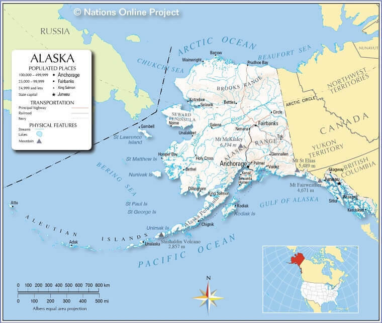
Alaskan View
Considering how far and removed Alaska is from the other US states, it’s easy to forget that it’s even a part of America. There’s a whole country in between them! Here’s the map the Alaskan schools use to teach kids all about their state.
It’s hilarious how it only shows Canada in the East but not much of America. Are we sure Alaska isn’t a part of Canada at this point? Because it seems like Alaska considers the US to be another country chilling down there.
